Top design concepts form the foundation of every successful visual project. Whether someone creates websites, posters, or mobile apps, these principles guide decisions that make or break a design. Understanding balance, contrast, hierarchy, and color theory separates amateur work from professional output.
Good design doesn’t happen by accident. It follows rules, sometimes breaking them intentionally, but always with purpose. This article covers the essential design concepts that every creative professional needs to master. From visual weight to white space, these fundamentals apply across disciplines and mediums.
Table of Contents
ToggleKey Takeaways
- Top design concepts like balance, contrast, hierarchy, and color theory form the foundation of every successful visual project.
- Mastering different types of balance—symmetrical, asymmetrical, and radial—helps create visually stable and engaging compositions.
- Contrast guides viewer attention and establishes focal points, but too much contrast creates chaos where nothing stands out.
- Strong visual hierarchy reduces cognitive load by clearly showing viewers what to read first and what matters most.
- White space improves comprehension and aesthetics—every element should earn its place, and unnecessary items should be removed.
- Color theory and typography choices directly impact mood, readability, and brand perception across all design work.
Balance and Visual Weight
Balance represents one of the most fundamental design concepts in visual communication. Every element on a page carries visual weight. Size, color, texture, and position all contribute to how “heavy” an object appears to viewers.
Symmetrical balance places equal visual weight on both sides of a central axis. This approach creates formal, stable compositions. Think of a traditional wedding invitation or a corporate logo. The brain processes symmetrical layouts quickly because they feel predictable and safe.
Asymmetrical balance offers more dynamic possibilities. Designers achieve equilibrium by placing a large element on one side and multiple smaller elements on the other. A bold headline on the left might balance three small images stacked on the right. This design concept creates movement and visual interest while maintaining stability.
Radial balance centers all elements around a single point. Mandala patterns and circular logos use this technique effectively. The eye naturally gravitates toward the center, making radial balance excellent for highlighting a focal point.
Visual weight also changes based on context. A small red square can balance a large gray rectangle because saturated colors appear heavier than muted ones. Dark objects feel heavier than light ones. Objects placed higher on a page seem lighter than those at the bottom.
Mastering balance requires practice and experimentation. Start by squinting at a design, this blurs details and reveals the overall weight distribution. If something feels “off,” the balance probably needs adjustment.
Contrast and Emphasis
Contrast creates visual interest and guides attention. Without contrast, designs feel flat and forgettable. This design concept uses difference to establish importance and create hierarchy.
Color contrast works most obviously. Black text on white backgrounds offers maximum readability. Complementary colors (like blue and orange) create vibrant tension. Designers use color contrast to draw eyes toward calls-to-action, important headlines, or key information.
Size contrast establishes clear relationships between elements. A massive headline paired with small body text tells readers exactly where to start. Scale differences communicate importance without requiring explanation.
Shape contrast adds variety to compositions. Mixing curved elements with angular ones prevents visual monotony. A circular logo against rectangular content blocks creates natural focal points. This design concept keeps viewers engaged longer.
Texture contrast often gets overlooked. Smooth gradients beside rough textures create tactile interest, even on flat screens. Photography with varied textures feels more dynamic than uniform imagery.
Emphasis flows naturally from contrast. The element with the highest contrast becomes the focal point. Smart designers control exactly where viewers look first, second, and third by manipulating contrast levels throughout a composition.
Too much contrast creates chaos. Everything fighting for attention means nothing stands out. Effective top design concepts require restraint, one or two focal points per composition work better than five.
Hierarchy and Layout Structure
Hierarchy organizes information by importance. This design concept tells viewers what to read first, what matters most, and how ideas connect. Without hierarchy, audiences must work too hard to understand a message.
Size establishes the most obvious hierarchy. Headlines appear larger than subheads. Subheads appear larger than body text. This convention works because humans learned it from centuries of printed materials.
Position also creates hierarchy. Western audiences read left-to-right and top-to-bottom. Important elements belong in the upper left quadrant where eyes naturally land first. Secondary information fits below or to the right.
Color and weight add additional hierarchy layers. Bold text signals importance within paragraphs. Colored links indicate clickable elements. These design concepts work together to create clear reading paths.
Layout structure provides the framework for hierarchy. Grid systems organize content into predictable patterns. The most common web layouts use 12-column grids that adapt to different screen sizes. Consistent spacing between elements creates rhythm and professionalism.
The F-pattern describes how people scan web pages. Eyes move horizontally across the top, then down the left side with occasional horizontal movements. Effective designers place key information along this F-shaped path.
The Z-pattern applies to simpler layouts with fewer elements. Eyes move from top-left to top-right, then diagonally to bottom-left, and finally to bottom-right. Landing pages often use Z-patterns to guide visitors toward conversion buttons.
Strong hierarchy reduces cognitive load. When viewers immediately understand what’s important, they engage more deeply with content. Confused visitors leave.
White Space and Minimalism
White space (also called negative space) refers to empty areas in a design. This design concept doesn’t waste space, it creates breathing room that improves comprehension and aesthetics.
Micro white space appears between letters, lines, and paragraphs. Proper letter-spacing (kerning) and line-height make text readable. Cramped text strains eyes and reduces reading speed.
Macro white space surrounds major elements and content blocks. Generous margins around headlines give them importance. Space between sections signals topic changes. Apple’s marketing materials demonstrate effective macro white space, products float in vast empty areas that communicate premium quality.
White space doesn’t need to be white. Any consistent background color functions the same way. Dark websites use black space. Textured backgrounds still provide negative space if they remain uniform.
Minimalism embraces white space as a core principle. This design concept removes everything unnecessary until only essential elements remain. Minimalist designs load faster, communicate clearer, and age better than cluttered alternatives.
But, minimalism isn’t always appropriate. Children’s websites, event posters, and entertainment brands often benefit from busier, more energetic layouts. The key lies in intentional choices, not defaulting to minimalism or maximalism without purpose.
Every element in a design should earn its place. If removing something doesn’t hurt the message, it probably shouldn’t exist. This ruthless editing defines professional design work.
Color Theory and Typography
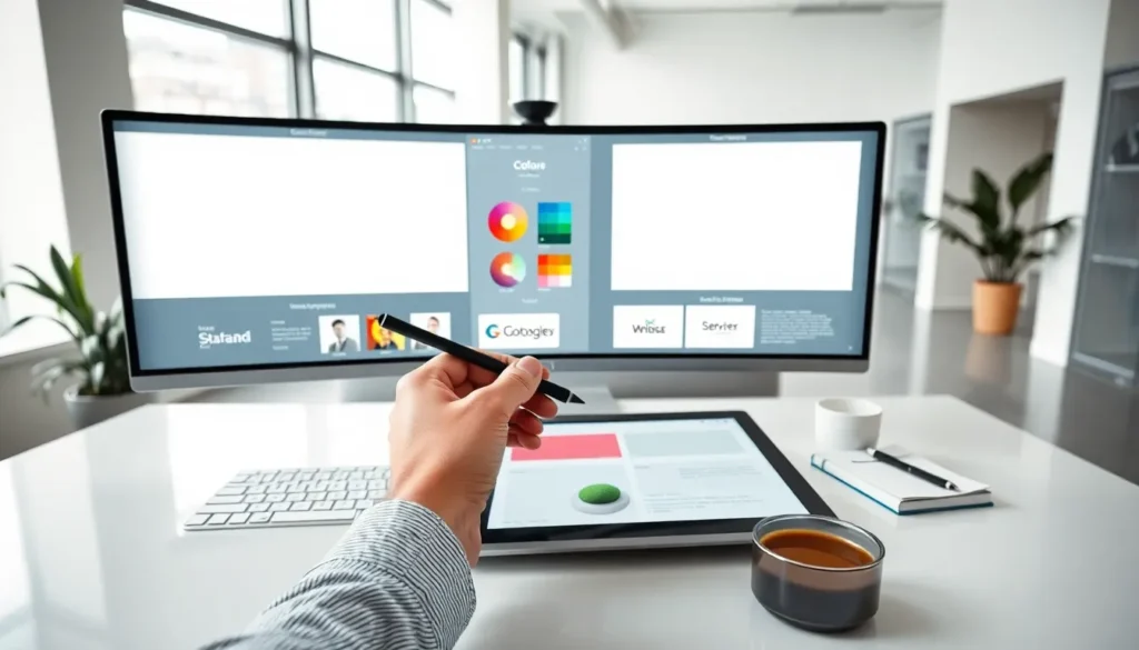
Color theory provides systematic approaches to choosing and combining colors. This design concept affects mood, readability, and brand perception more than any other element.
The color wheel organizes hues by their relationships. Complementary colors sit opposite each other (red and green, blue and orange). They create maximum contrast and visual vibration. Analogous colors sit beside each other (blue, blue-green, green). They produce harmonious, calming combinations.
Triadic color schemes use three colors evenly spaced around the wheel. This approach offers variety while maintaining balance. Many successful brands use triadic palettes, think of the primary colors in Google’s logo.
Color psychology influences viewer emotions. Blue conveys trust and professionalism. Red signals urgency and passion. Green suggests growth and nature. Yellow communicates optimism. These associations vary slightly across cultures, so designers must consider their audience.
Typography carries equal weight among top design concepts. Font choices communicate personality before readers process a single word. Serif fonts (with small lines at letter ends) feel traditional and trustworthy. Sans-serif fonts appear modern and clean.
Font pairing combines different typefaces for visual interest. A common approach pairs a decorative headline font with a readable body font. Two fonts usually suffice, three maximum. More creates visual noise.
Line length affects readability significantly. Optimal line length falls between 50-75 characters. Longer lines tire eyes. Shorter lines interrupt reading flow. This design concept explains why newspapers use narrow columns and websites limit content width.
Font size matters for accessibility. Body text below 16 pixels strains most readers. Sufficient contrast between text and background ensures everyone can read content comfortably.


