Typography isn’t just about picking a pretty font; it’s the secret sauce that can make or break a design. Imagine reading a beautifully crafted message only to be distracted by a font that looks like it was designed in 1995. It’s a tragedy. Understanding typography rules is like having a cheat sheet for creating visually stunning and effective communication.
Table of Contents
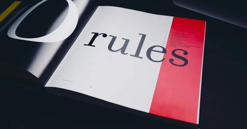
ToggleUnderstanding Typography Rules
Typography encompasses various principles that govern font selection, spacing, and layout, all vital for effective design. Readability stands as a cornerstone of typography; text must be easy to read across different mediums. Styles play a major role. Serif fonts typically convey tradition and respect, while sans-serif fonts are modern and clean.
Consistency enhances a design’s professionalism. Maintaining uniform font sizes, weights, and styles throughout a project ensures cohesion. Contrast also matters; pairing bold headers with lighter body text improves visual hierarchy and draws attention to key information. Alignment contributes to organization. Left alignment is common for readability, while center alignment may add elegance.
Whitespace shouldn’t be overlooked; leaving ample space around text separates elements and enhances focus. Size impacts legibility. Body text generally ranges from 10 to 12 points for optimal reading comfort, while headings should be proportionally larger. Color choice affects mood and should align with the design’s purpose.
Tracking, or letter spacing, influences readability as well. Increasing letter spacing can improve clarity in larger text but may hinder small text’s legibility. Leading, or line spacing, impacts the flow of text. A good rule of thumb is to set line height at 1.5 times the font size to create breathing room.
Lastly, hierarchies identify the importance of information. Utilizing varying font sizes, types, and weights establishes a clear visual pathway for the reader. Following these typography rules elevates design and facilitates effective communication, making it essential for designers to master them.
The Importance of Typography
Typography plays a crucial role in design, influencing both communication and visual appeal.
Readability and Legibility
Readability defines how easily text can be read. Legibility focuses on how distinguishable characters are from one another. Optimal font choices and sizes enhance readability across various devices. Body text should typically range from 10 to 12 points for maximum comfort. Maintaining appropriate line spacing and letter spacing significantly improves legibility. A well-designed layout, featuring proper alignment and ample whitespace, aids in visual clarity. Selecting contrasting font styles for headers and body text establishes a clear visual hierarchy. Following these guidelines directly impacts user experience, fostering engagement and comprehension.
Branding and Aesthetics
Effective typography strengthens branding efforts. Specific font styles convey brand identity; serif fonts often suggest tradition, while sans-serif fonts resonate with modernity. Consistent font usage across branding materials enhances professionalism and recognition. Typography not only influences first impressions, but also establishes an emotional connection with the audience. Utilizing unique typefaces can differentiate a brand in the market. Artful integration of typography with visual elements contributes to a cohesive aesthetic. Prioritizing these aspects allows brands to communicate messages vividly and memorably.
Fundamental Typography Rules
Typography plays a crucial role in design and communication. Adhering to established rules enhances the overall effectiveness of text presentation.
Font Selection
Selecting the right font impacts readability and brand perception. Serif fonts often evoke tradition, while sans-serif fonts provide a modern feel. Choosing fonts based on their context ensures they align with intended messaging. It’s important to avoid using too many font styles in one design. Limiting font options to two or three creates a cohesive look. Considering legibility across various devices enhances the audience’s experience. Testing different fonts on target demographics helps refine choices.
Line Length and Spacing
Well-structured line length improves reading flow. Aim for 50 to 75 characters per line for optimal comprehension. Proper line spacing ensures text doesn’t appear cramped. A leading of 1.5 times the font size enhances readability and visual appeal. It’s essential to give ample whitespace around blocks of text, which provides breathing room. Effective use of spacing can guide the reader’s eye, helping them navigate content easily. Adjusting line lengths for different screen sizes ensures versatility across platforms.
Hierarchy and Contrast
Creating visual hierarchy directs reader attention strategically. Varying font sizes and styles clarifies the importance of information. Readers benefit from a strong contrast between headings and body text, enhancing focus on key points. Utilizing bold or larger text establishes priority and guides interpretation. Color contrast further aids in distinguishing sections, which encourages engagement. Ensuring consistency in hierarchy across materials builds familiarity and trust with the audience. Prioritizing these methods strengthens communication, allowing important messages to resonate effectively.
Advanced Typography Techniques
Advanced typography techniques enhance overall design quality and communication effectiveness. Two critical aspects are kerning and tracking, alongside the application of typography in web design.
Kerning and Tracking
Kerning involves adjusting the space between individual letter pairs to achieve a balanced appearance. Tracking, on the other hand, refers to the spacing across a range of letters within a word or a line. Both elements impact readability and aesthetic appeal significantly. Consistent kerning provides a polished, professional look, while appropriate tracking ensures comfortable reading experiences. Adjusting these spacing techniques can guide the viewer’s eye smoothly along the text, improving the overall flow and engagement in design layouts.
Typography in Web Design
Typography plays a pivotal role in web design, influencing user interaction and experience. Attention to font selection fosters visual clarity and accessibility across varying devices. Using responsive typography adjusts text size based on screen dimensions, ensuring readability on mobile and desktop platforms. Furthermore, clear hierarchy through size and weight differentiation directs users to important content. Designers should utilize web-safe fonts and consider loading times, as these factors also affect site performance. Prioritizing effective typography enhances aesthetic cohesion and enhances overall engagement for website visitors.
Common Typography Mistakes to Avoid
Neglecting readability leads to confusion and frustration for readers. Users often disengage when text lacks clarity. Using too many font styles creates a disjointed appearance. Stick to two or three complementary fonts for cohesion.
A common mistake lies in inconsistent font sizes and weights. Consistency reinforces professionalism. Excessive use of different colors can overwhelm the visual experience. Utilizing a limited color palette helps maintain focus on important elements.
Ignoring alignment affects the overall flow of the design. Left alignment is generally easier to read, especially in body text. Overlooking whitespace results in cluttered layouts. Providing adequate space between elements enhances focus and comprehension.
Opting for excessive line lengths may strain the reader’s eyes. Aim for 50 to 75 characters per line to promote ease of reading. Inadequate leading can also diminish clarity. Increasing line spacing to 1.5 times the font size optimizes readability.
Failing to establish a visual hierarchy can confuse readers about the content’s structure. Utilizing varying font sizes and styles directs attention effectively. Not testing typography across different devices affects user experience, especially in web design. Ensuring responsive typography adapts to diverse screens is vital.
Skipping basic kerning and tracking adjustments can result in awkward spacing. Taking the time to fine-tune these elements improves aesthetics and overall legibility. Prioritizing these typography rules helps avoid common pitfalls and elevates design quality. Focus on these principles for impactful communication and enhanced user engagement.
Typography plays a crucial role in design and communication. By mastering the essential rules outlined, designers can create visually appealing and effective content. Adhering to principles like readability, consistency, and proper alignment not only enhances the aesthetic but also ensures the message resonates with the audience.
Attention to detail in spacing and hierarchy can significantly improve user engagement. Avoiding common typography mistakes further elevates design quality. Ultimately, prioritizing effective typography leads to stronger branding and a more memorable user experience, making it an indispensable aspect of any successful design strategy.